
Die Biblioteek

Mobile App
E-Reading Platform
project banner image project banner image
project banner image

Die Biblioteek

Die Biblioteek

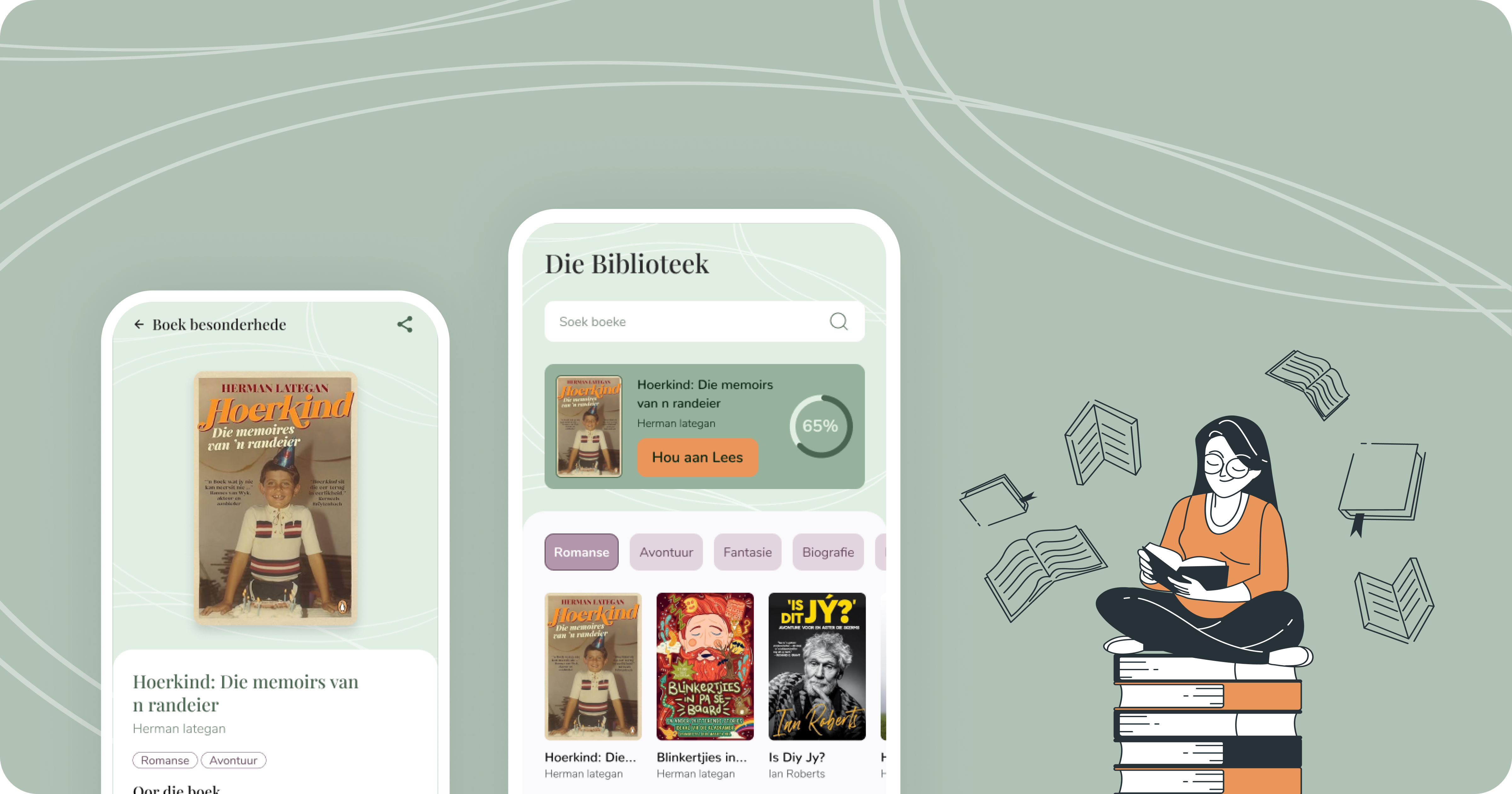
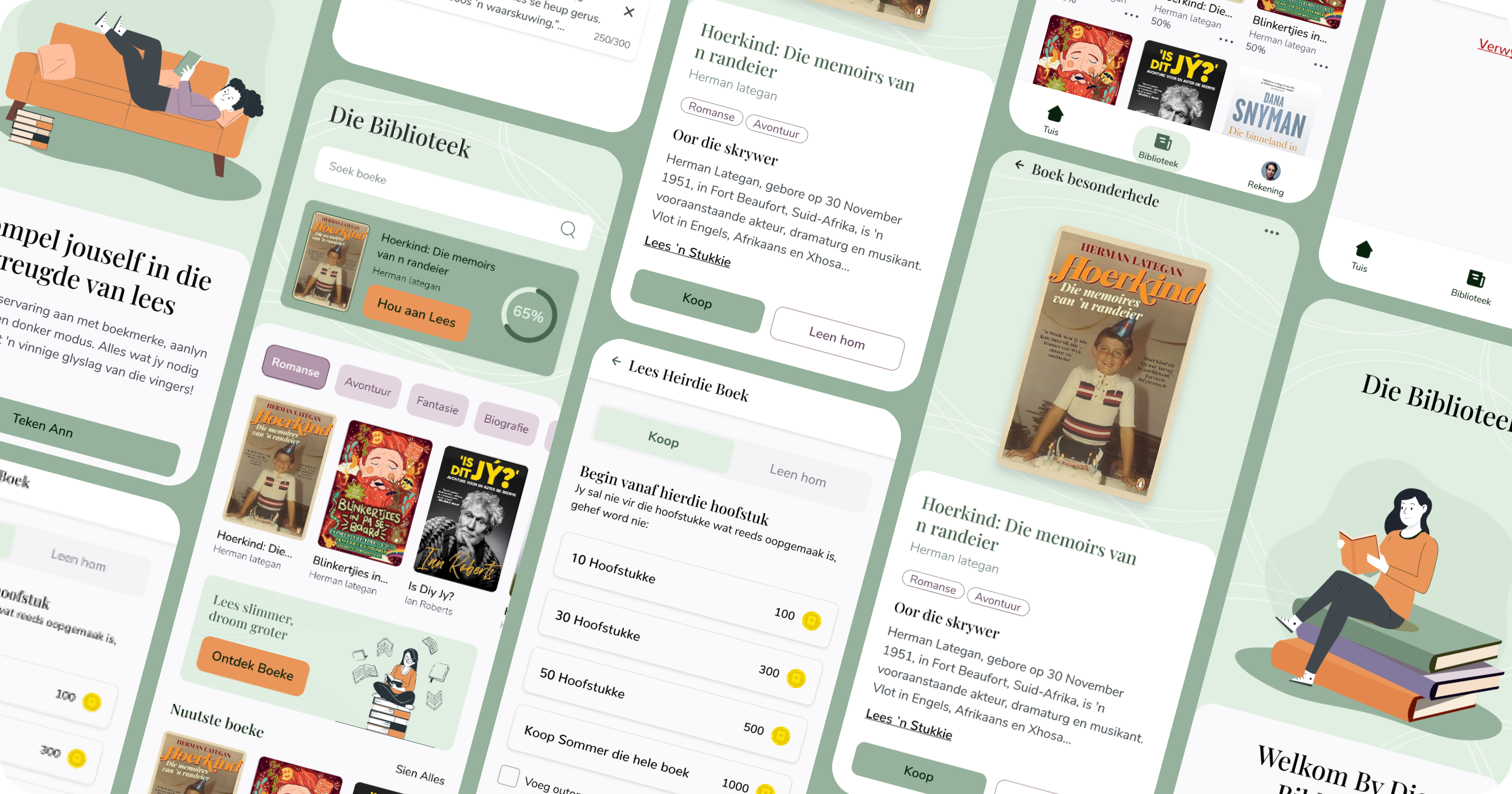
Die Biblioteek is a mobile app offering Afrikaans-speaking readers access to a variety of digital books. Using a credit-based system called "Book Coins," users can easily purchase and enjoy stories across genres like fiction, poetry and children's books.

Key features include offline reading, story previews, personalised recommendations and a flexible library. The app promotes literacy and cultural preservation, delivering a seamless and engaging reading experience for Afrikaans users.


client
Die Biblioteek
duration
1 Year
resources
team member image team member image team member image team member image
services
- Functional spec
- Design
- Development

Design direction : Mood board

context

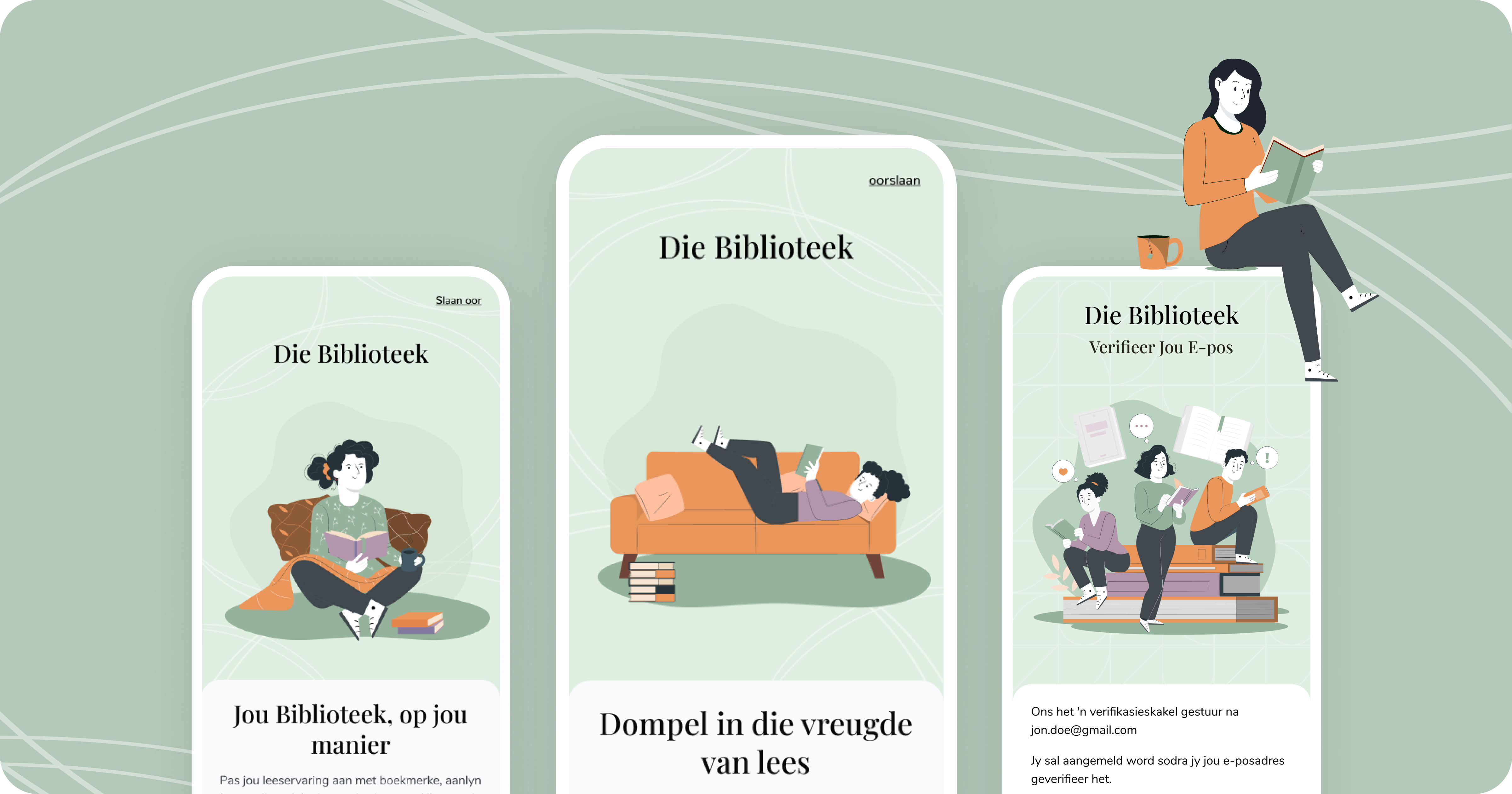
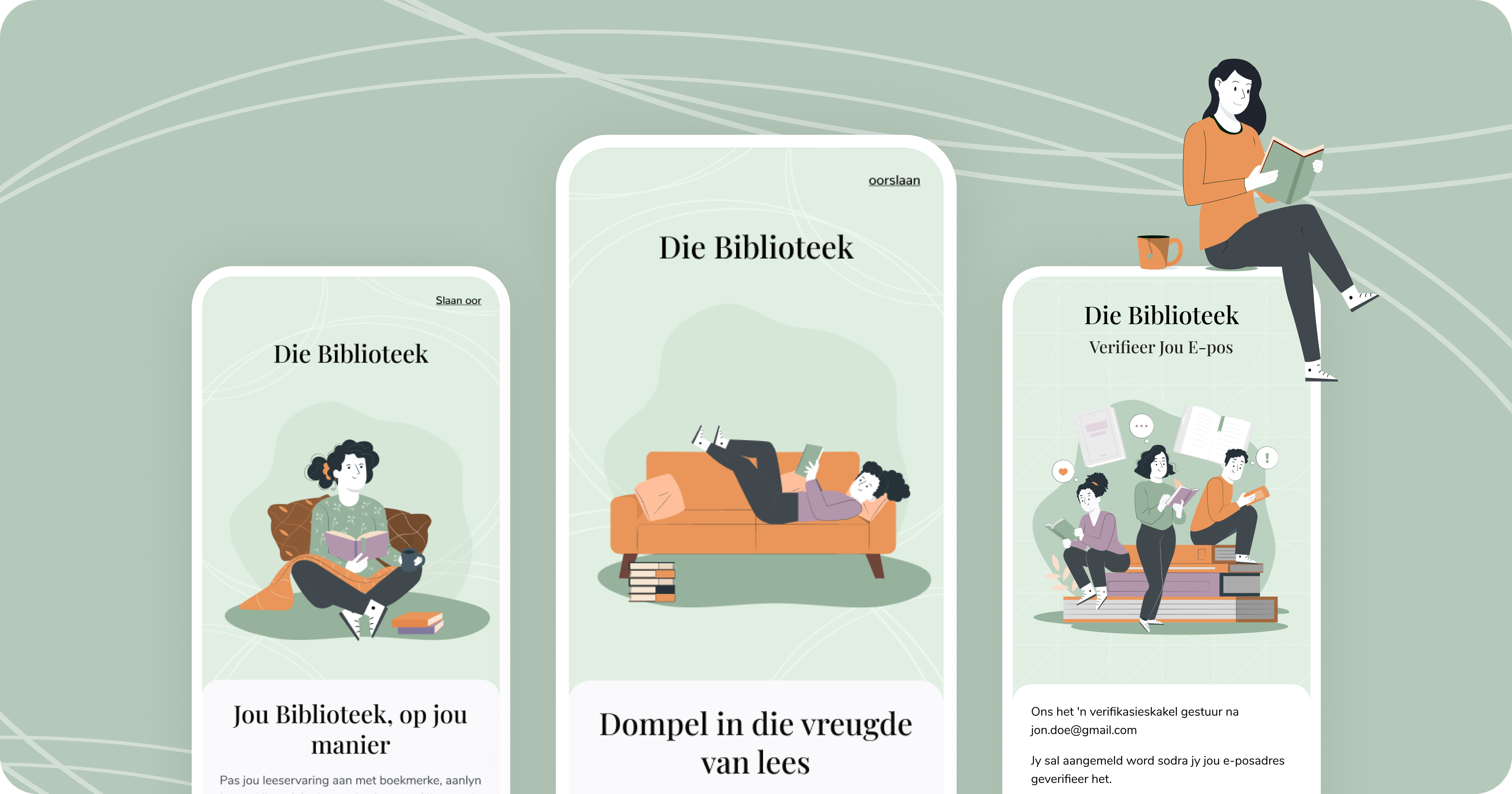
Our work on Die Biblioteek reflects a dedication to creating a user-friendly digital reading experience for Afrikaans speakers. The process began by understanding the app's core purpose, offering easy access to a diverse collection of Afrikaans stories through an intuitive, credit-based system. A key part of this process was developing a mood board that captured the app's essence with blending cultural authenticity, warmth and modern simplicity. This visual foundation shaped our design approach, ensuring it aligns with user needs and the app's mission to promote Afrikaans literacy.

what we did

In the research phase, we explored Die Biblioteek's audience, their reading habits and the digital publishing landscape. This informed our mood board, which established a visual language focused on warmth, accessibility and clarity. By combining clean typography, inviting colour palettes and intuitive navigation cues, we created a cohesive design framework that supports Die Biblioteek's goal of delivering a seamless and engaging reading experience.

project banner image project banner image

Style Guide

Design Elements

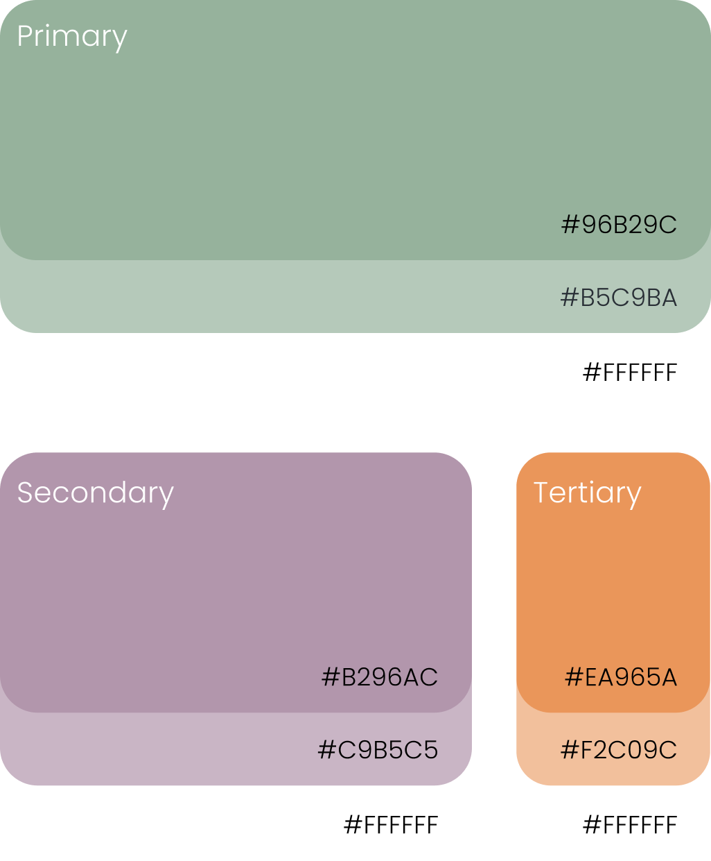
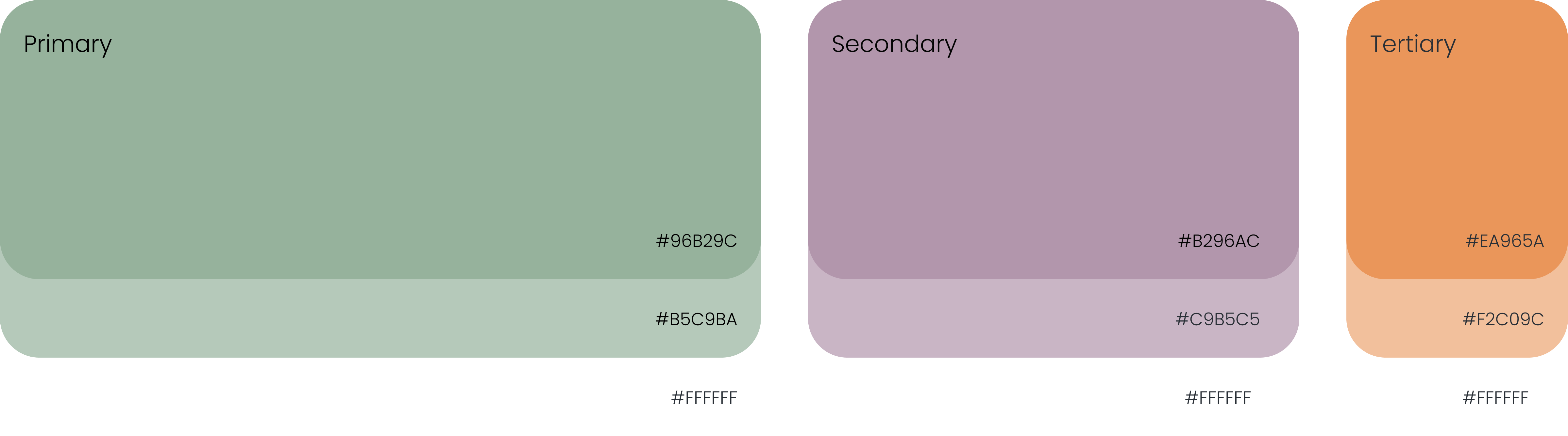
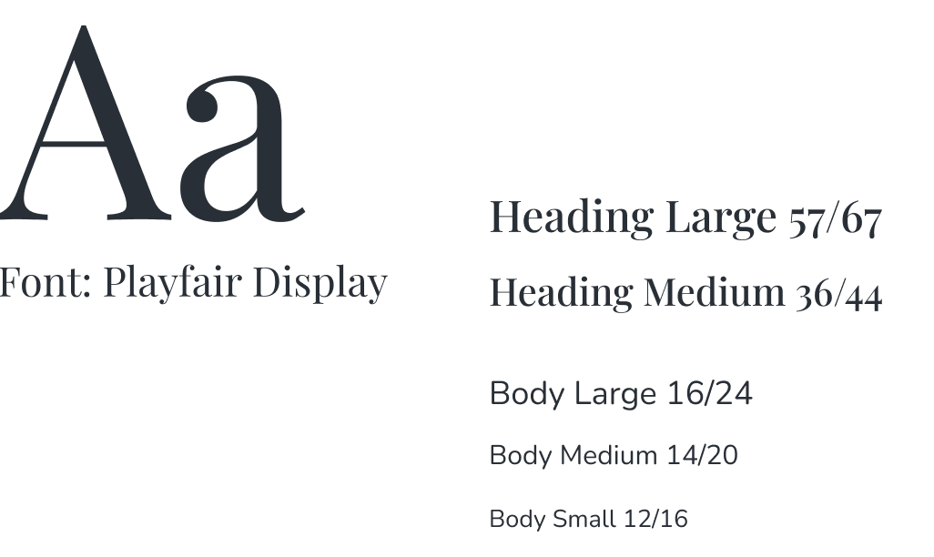
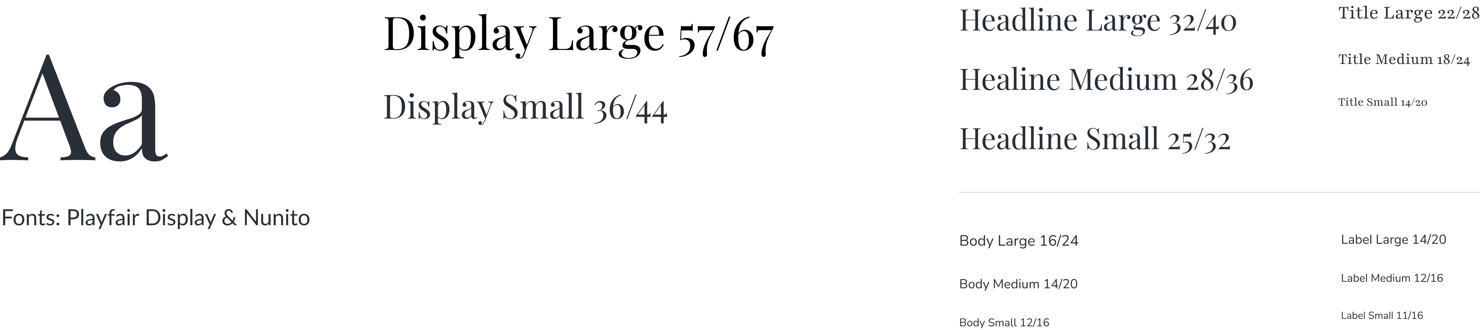
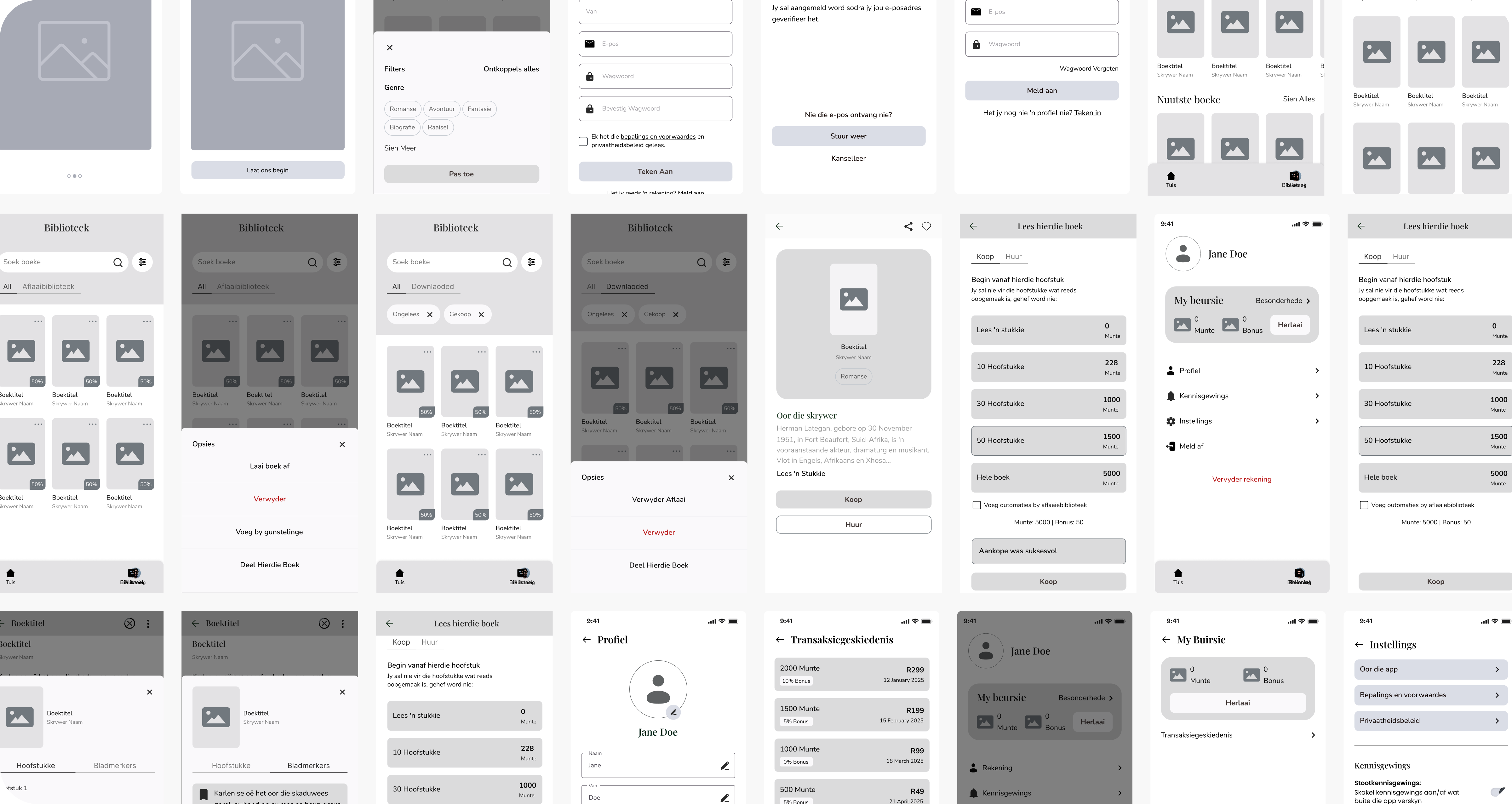
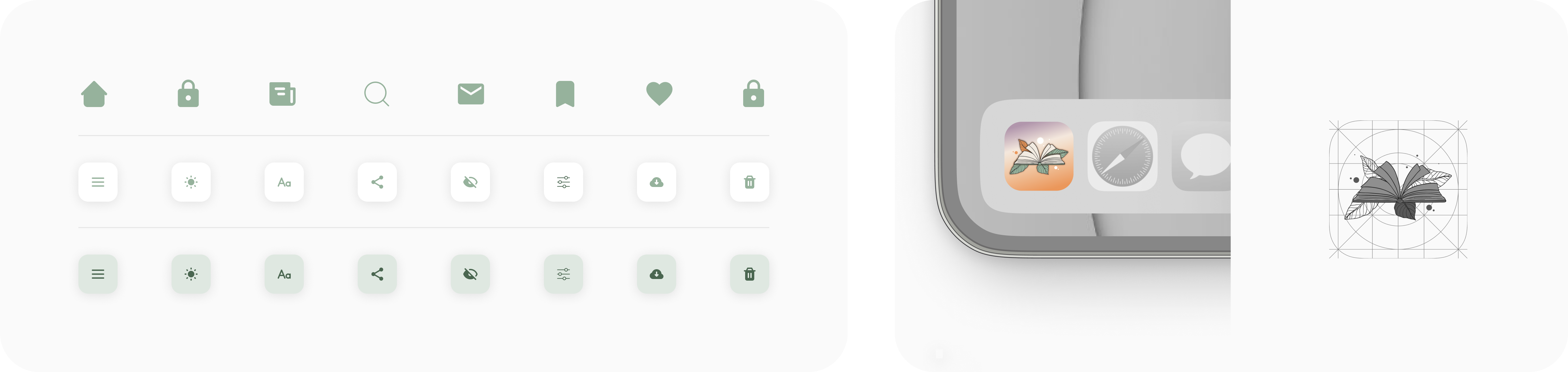
The style guide for Die Biblioteek ensures a cohesive user experience by defining core design elements such as typography, colours and layouts. This consistent visual language reinforces the app's identity while enhancing readability and ease of use. It also supports efficient collaboration, maintaining design accuracy and scalability as the platform evolves.

User experience (UX)

In the UX phase of our work on Die Biblioteek, we focused on creating an intuitive, user-friendly platform that makes discovering and purchasing Afrikaans stories simple. Our goal was to deliver a smooth, engaging experience that meets the needs of both new and returning users.
We prioritised a seamless credit-based purchasing system, allowing users to easily buy and track "Book Coins," view their transaction history and manage their library. This clarity encourages trust and long-term engagement with the app.
User flows were carefully designed to guide users from account creation to book discovery and reading. We emphasised easy navigation, enabling users to browse genres, preview stories and manage their purchases effortlessly. Special attention was given to offline access, ensuring users can download and enjoy their books without an internet connection.
Through usability testing and iteration, we refined the app to align with user expectations. By focusing on simplicity and accessibility, we ensured that Die Biblioteek delivers a seamless reading experience, making it easy for users to find, purchase and enjoy Afrikaans stories.
During the UX phase of Die Biblioteek, we focused on creating an intuitive and user-friendly platform that makes discovering and purchasing Afrikaans stories simple. Our goal was to create a smooth and engaging experience for both new and returning users.
User flows were carefully designed to guide readers from account creation through to discovering, purchasing and enjoying books. Easy navigation allows users to browse genres, preview stories, manage purchases and access downloaded books for offline reading.
We also developed a seamless Book Coin system, making it easy for users to purchase and track credits, view transaction history and manage their personal library. Through usability testing and iteration, we refined the experience to ensure a simple, accessible and seamless reading journey.
project banner image project banner image

User interface (UI)

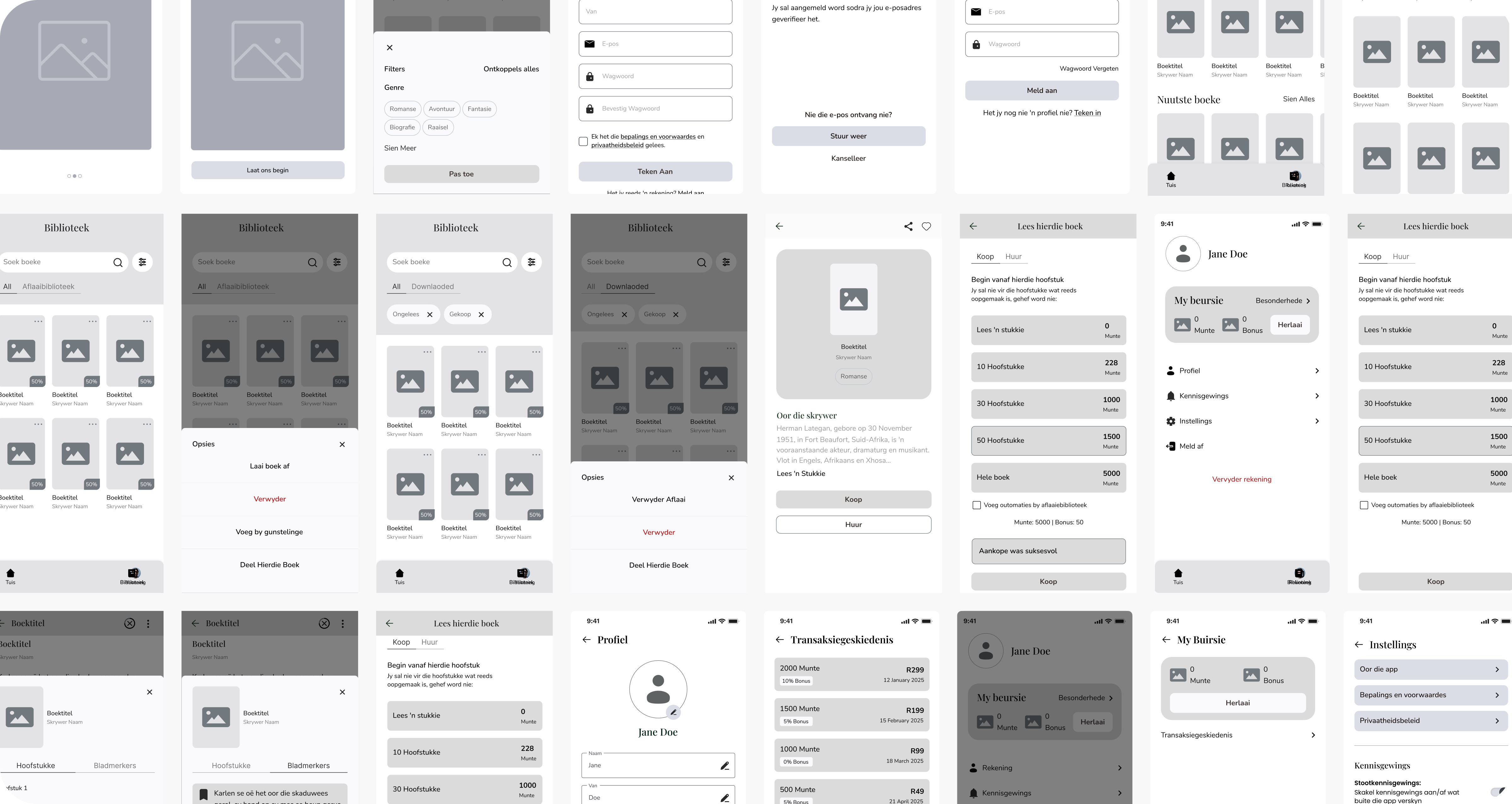
During the UI phase of Die Biblioteek, we aimed to design a clean and accessible interface that balances cultural authenticity with modern digital experiences. Our goal was to create a visually appealing platform that simplifies book discovery and enhances the reading journey.
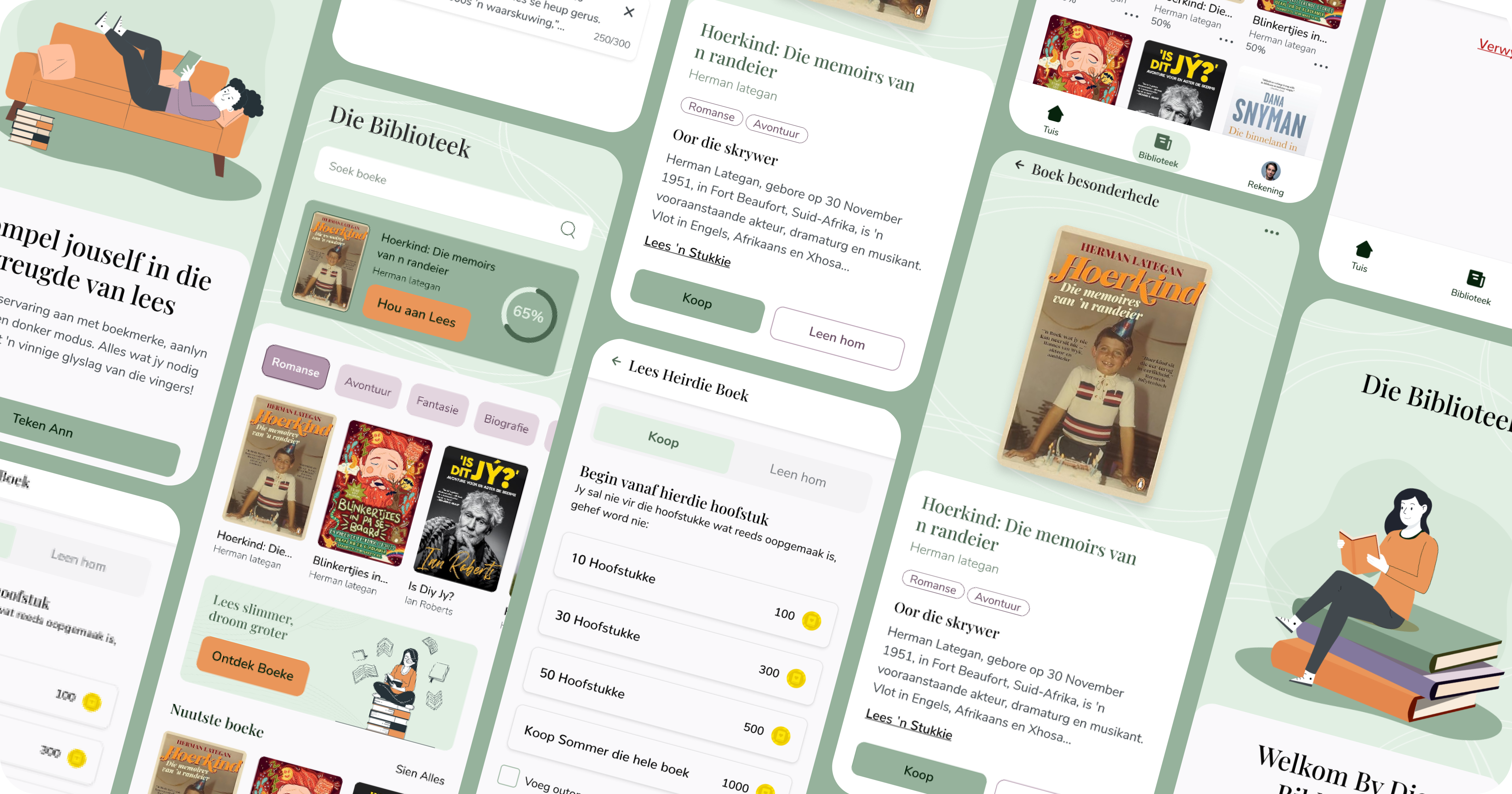
We designed an intuitive home screen with clear genre categories, advanced search tools and a user-friendly grid layout to ensure easy browsing. The credits system is seamlessly integrated, allowing users to track and spend their "Book Coins" with ease.
Inspired by leading digital libraries, we crafted a clear and inviting interface that supports story previews, offline reading and personalised libraries. Each element was designed to enhance usability while maintaining a warm and approachable aesthetic.
We also focused on accessibility and responsiveness, ensuring a consistent experience across devices. Whether on a smartphone or tablet, the UI adapts smoothly, allowing users to explore and enjoy stories anytime. This design approach supports Die Biblioteek's mission to provide a seamless and engaging reading platform for Afrikaans users.
During the UI phase of Die Biblioteek, we focused on creating a clean, accessible interface that combines cultural authenticity with a modern digital reading experience.
Inspired by leading digital libraries, we designed a warm and inviting interface that makes discovering, previewing and enjoying Afrikaans stories simple. The home screen features clear genre categories, search functionality and an easy-to-browse layout, while personalised libraries and offline reading enhance the overall experience.
The Book Coin system is seamlessly integrated, allowing users to easily track and spend their credits. We also prioritised responsiveness and accessibility, ensuring the platform delivers a consistent and intuitive experience across both smartphones and tablets.
project banner image project banner image

Our challenge

Apostrophe image

Making Afrikaans stories easy to discover, purchase and enjoy.

Die Biblioteek needed to provide Afrikaans readers with an intuitive way to discover and access digital books while supporting a credit-based purchasing system. The experience needed to be easy to navigate for both new and returning users, while incorporating features such as story previews, personalised libraries and offline reading.
A key challenge was creating clear user flows that connected book discovery, Book Coin purchases and library management into one seamless journey. The platform also needed a visual identity that balanced cultural authenticity with a modern, accessible digital experience.

Our solution

Apostrophe image

A simple, accessible platform for seamless book discovery.
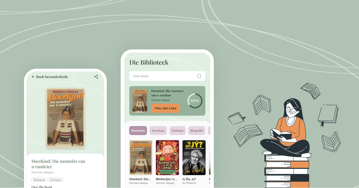
We designed a user-friendly mobile experience with clear navigation, genre browsing, search functionality and story previews to make discovering books effortless. A seamless Book Coin system allows users to purchase and track credits, manage transactions and build their personal library with ease.
Through UX research, usability testing and an established visual style guide, we created a warm and modern interface that remains consistent across devices. Features such as personalised libraries and offline reading ensure users can access and enjoy Afrikaans stories anytime, supporting Die Biblioteek's mission to promote literacy and cultural preservation.
project banner image project banner image

Explore our UX/UI Design Services.

Similar Projects
project banner image
Cash4Trash
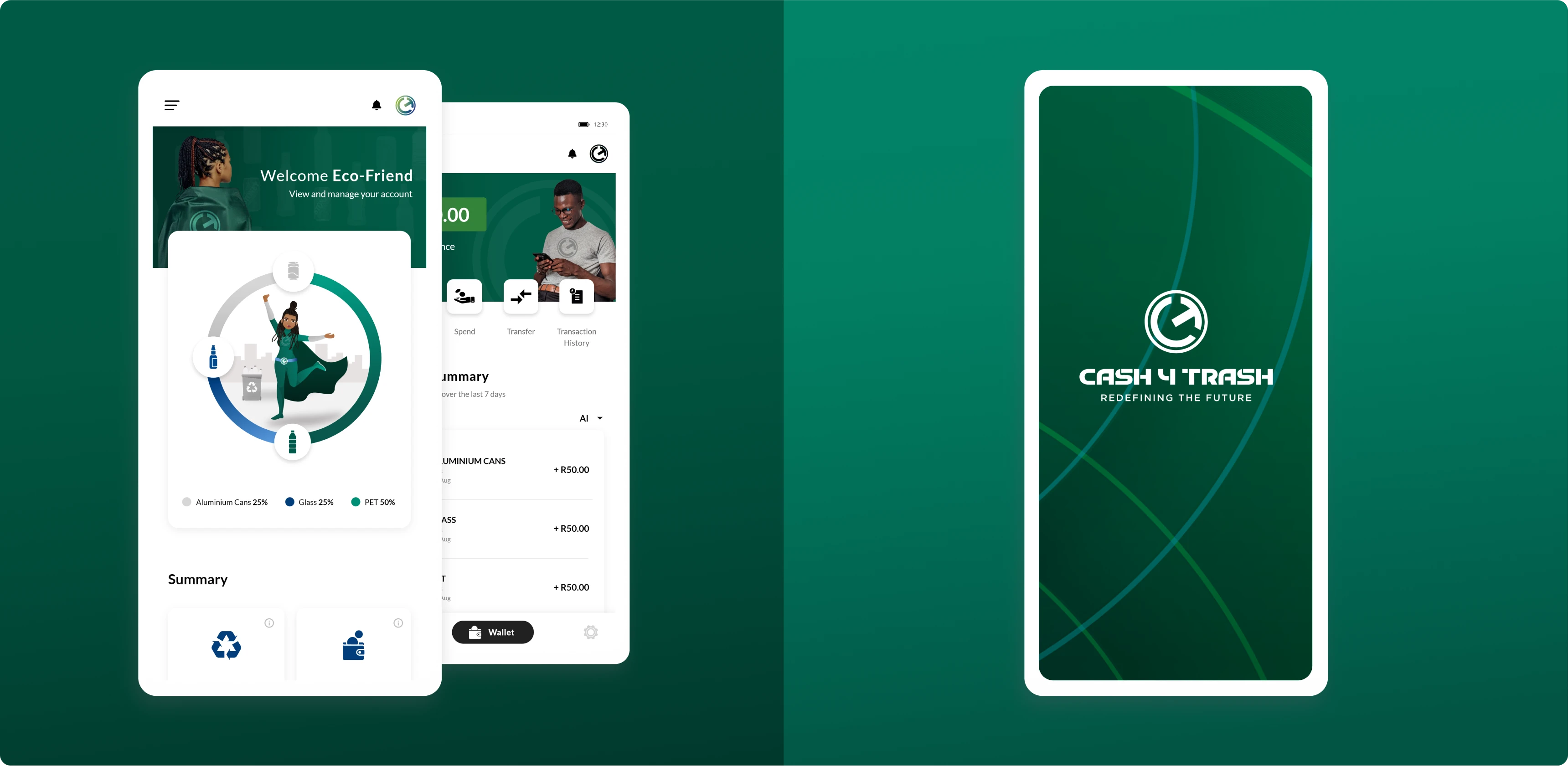
Cash4Trash is dedicated to revolutionising recycling practices across Africa, empowering communities while preserving our planet. Their innovative approach introduces the concept of green currency, incentivising individuals to participate in environmental conservation efforts.
project banner image
Izili
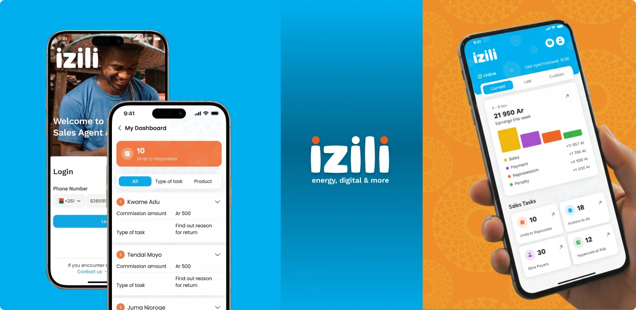
The Izili project focused on designing a user-friendly digital platform to support sales agents in delivering clean energy solutions to customers. The goal was to streamline the sales journey, simplify customer onboarding, and improve the overall experience for agents working in the field.
project banner image
Pfizer
Most cigarette smokers want to quit, but fewer than one in ten smokers succeed in quitting without the right support mechanisms in place. At CubeZoo, we believe in leveraging technology to create meaningful solutions that drive positive change. Our partnership with Pfizer Pharmaceuticals exemplified this ethos, particularly in our collaboration to support South African smokers in their journey to quit.