HICO Group
HICO Group
HICO Group
HICO Group is a leader in data intelligence, providing large global enterprises with expert consultancy and AI-driven solutions. Their focus is on transforming complex data into actionable insights, enabling businesses to make informed decisions and maintain a competitive edge. With a commitment to innovation, they equip organisations with the tools and knowledge to navigate the evolving data landscape.
Over the next 3-5 years, HICO aims to achieve a 15-20% annual growth rate by expanding their client base, particularly among German-headquartered enterprises. By enhancing existing relationships and leveraging cutting-edge technologies, they continue to solidify their position as a trusted data intelligence powerhouse.


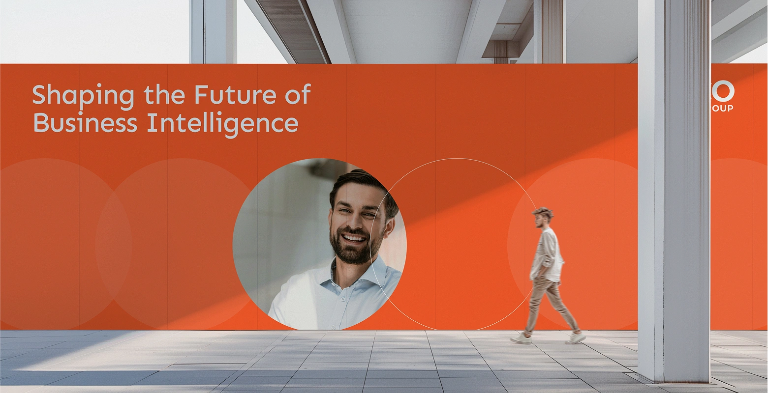
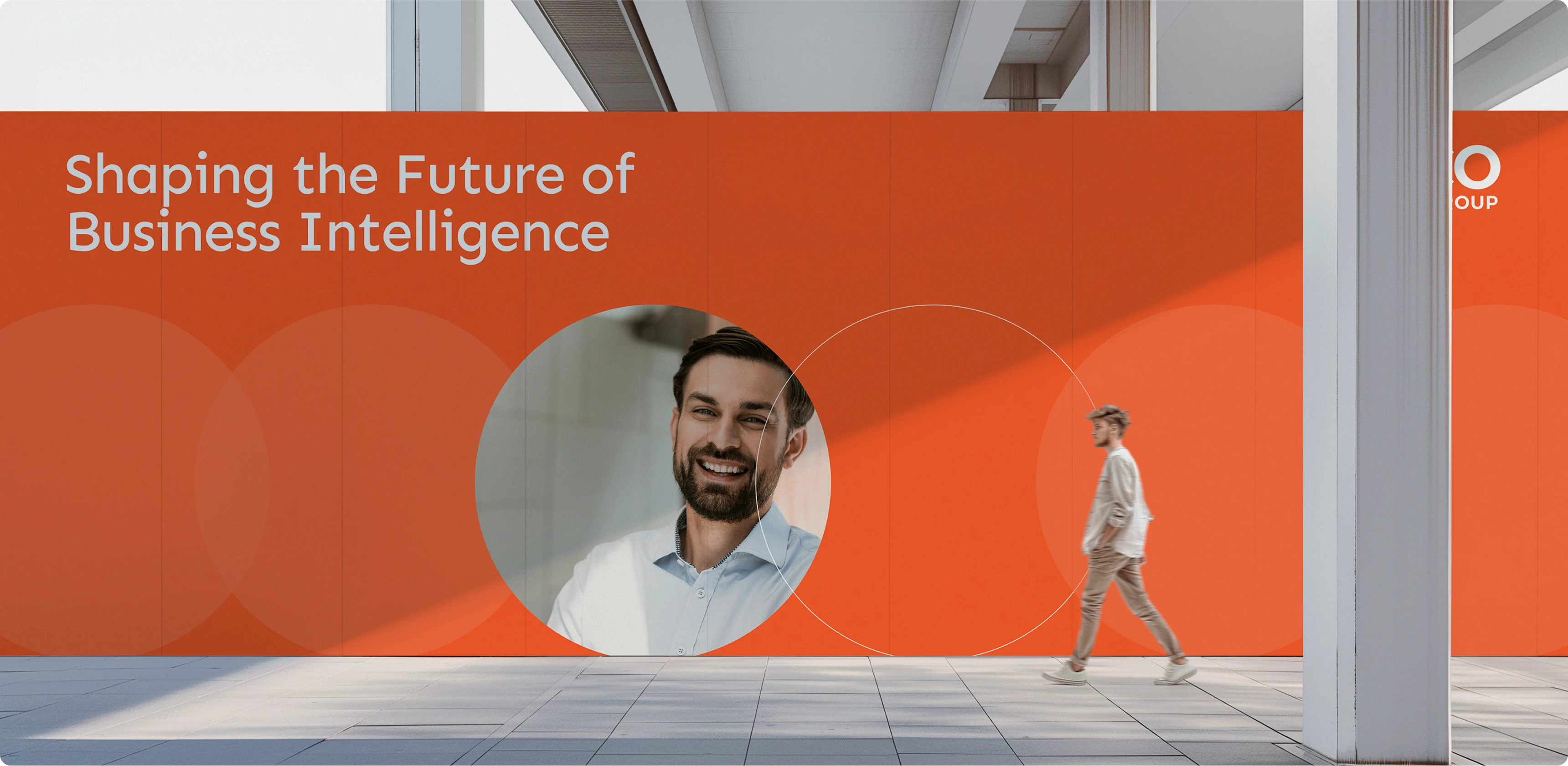
Logo Refresh
context
The HICO Group logo refresh was a strategic initiative aimed at modernising the brand’s identity while maintaining its core essence. The existing logo, with its emphasis on 'CO,' symbolised collaboration, stability, and coordination—key principles of the company. The challenge was to retain these elements while refining the aesthetics to better reflect HICO’s forward-thinking and tech-savvy image.
what we did
We refined the typography and visual balance of the logo, ensuring it appeared more contemporary and professional without losing its recognisable structure. The colours were slightly adjusted for a more modern appeal, maintaining the original blue and orange while enhancing their vibrancy. The result was a sleek, adaptable logo that preserves brand familiarity while projecting a more innovative and dynamic identity.
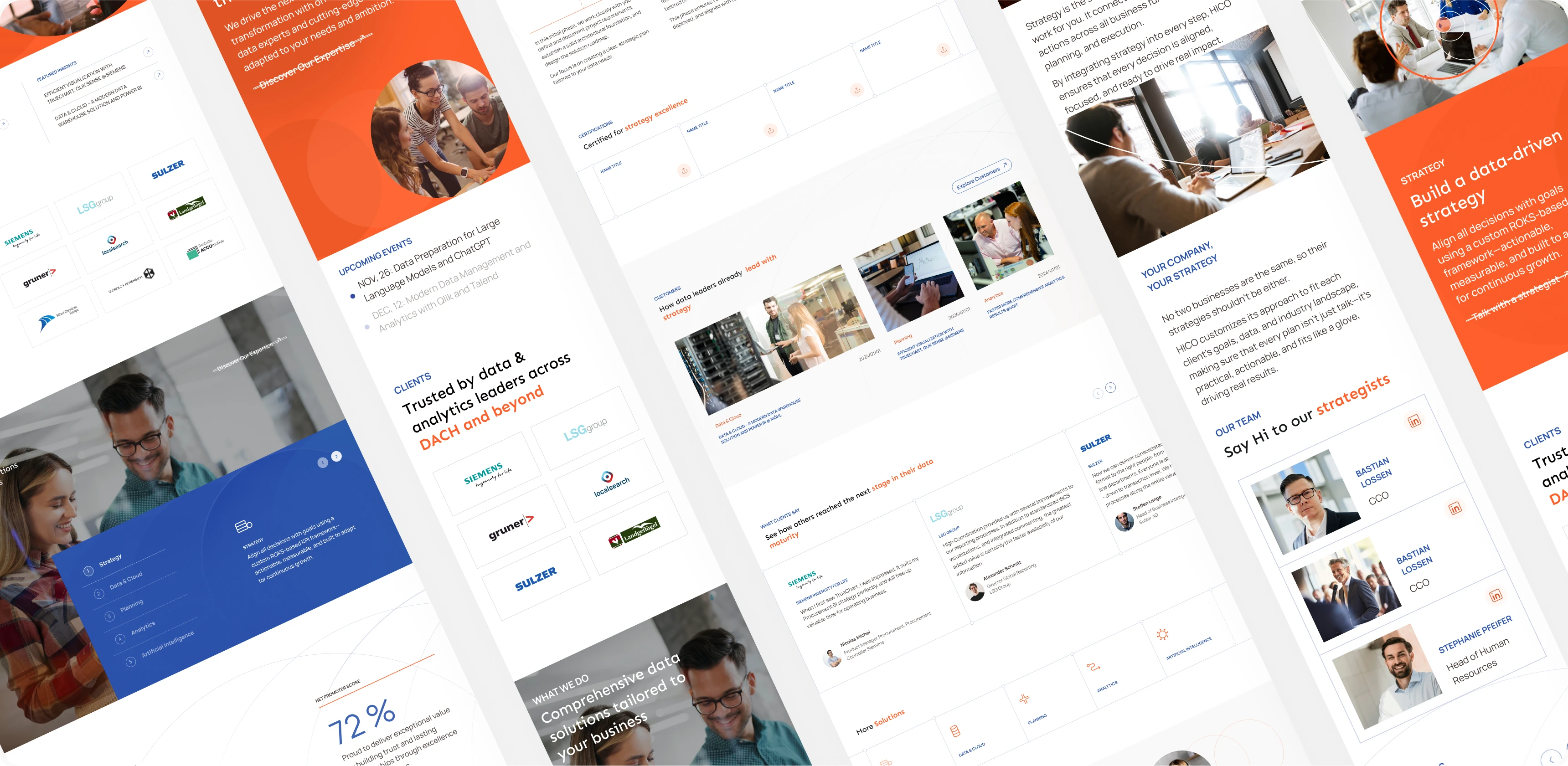
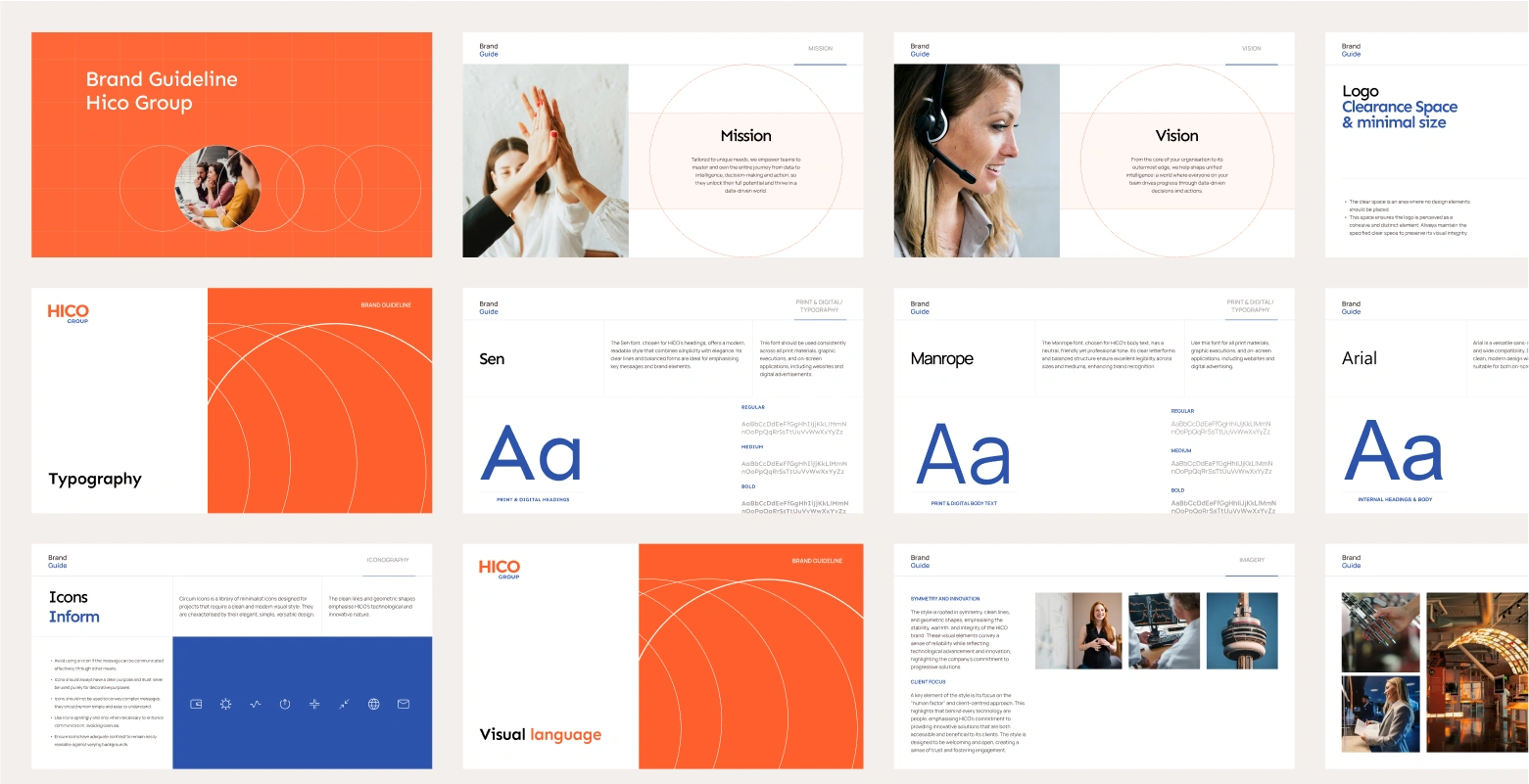
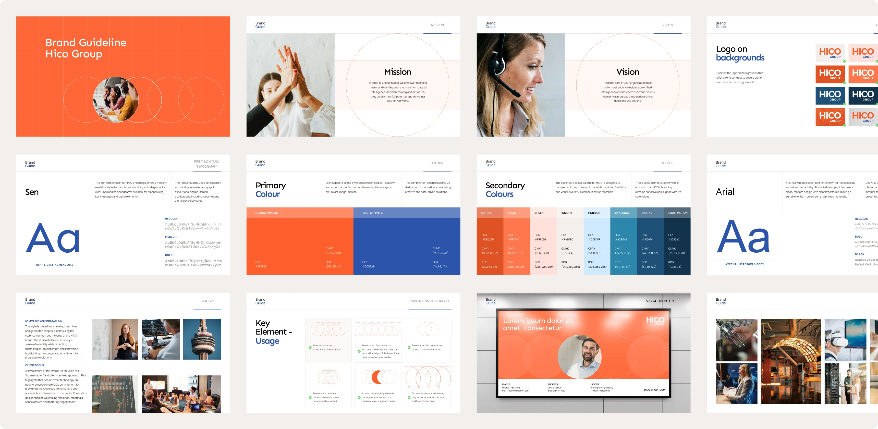
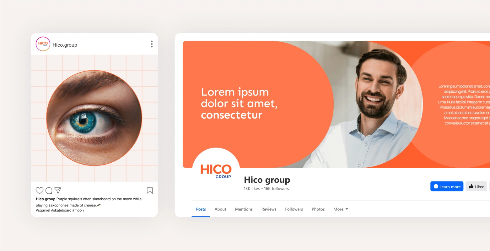
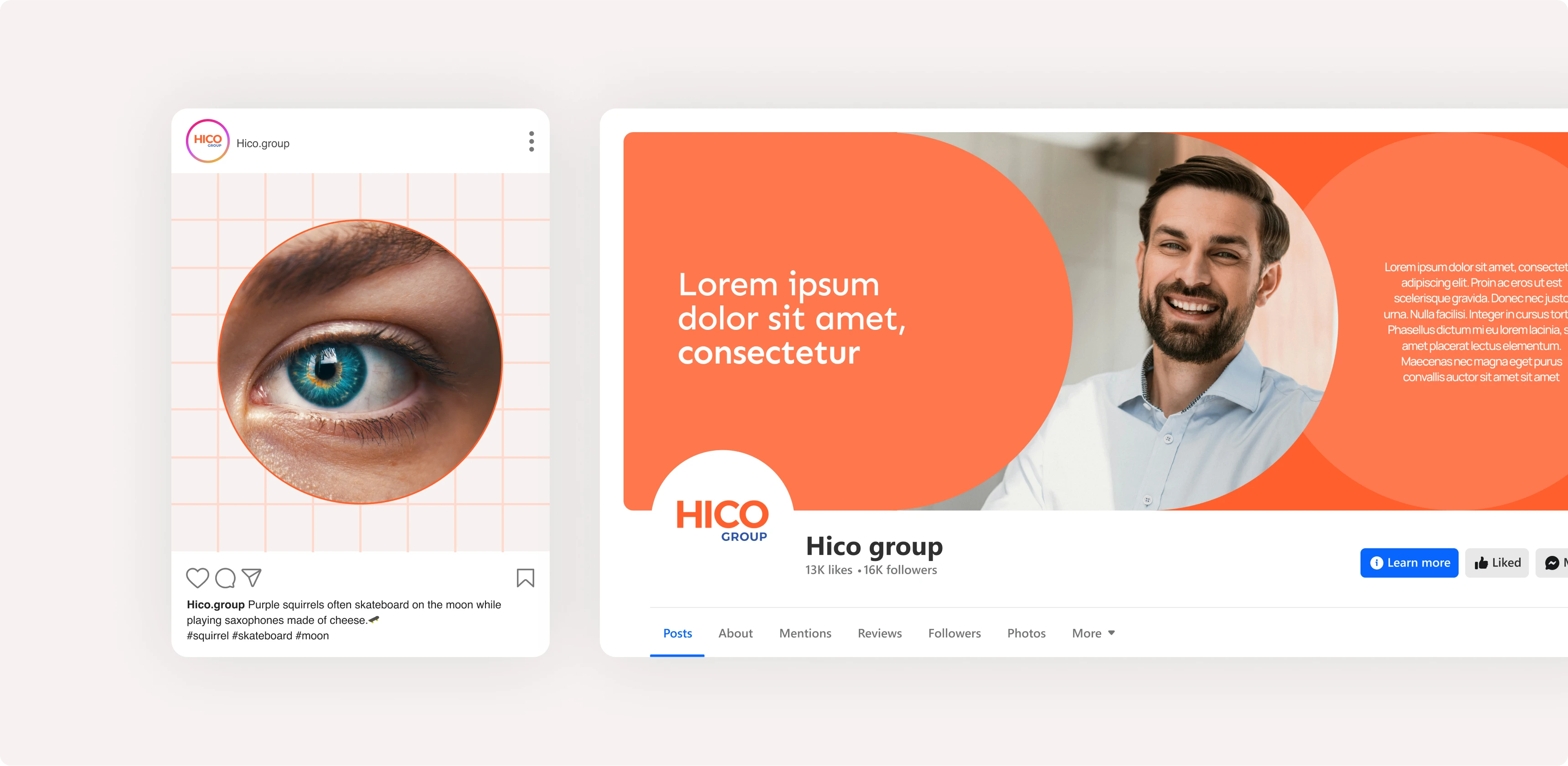
Brand Guide
design elements
The brand guide focused on maintaining consistency across all touch points. We updated the typography to a combination of Sen and Manrope for a clean, modern, and highly legible look. The colour palette was refined to ensure harmony across digital and print mediums, with deep blues symbolising trust and reliability, and orange representing energy and innovation. Patterns and textures were subtly integrated to enhance visual depth and support the brand’s AI-driven, data-centric positioning.
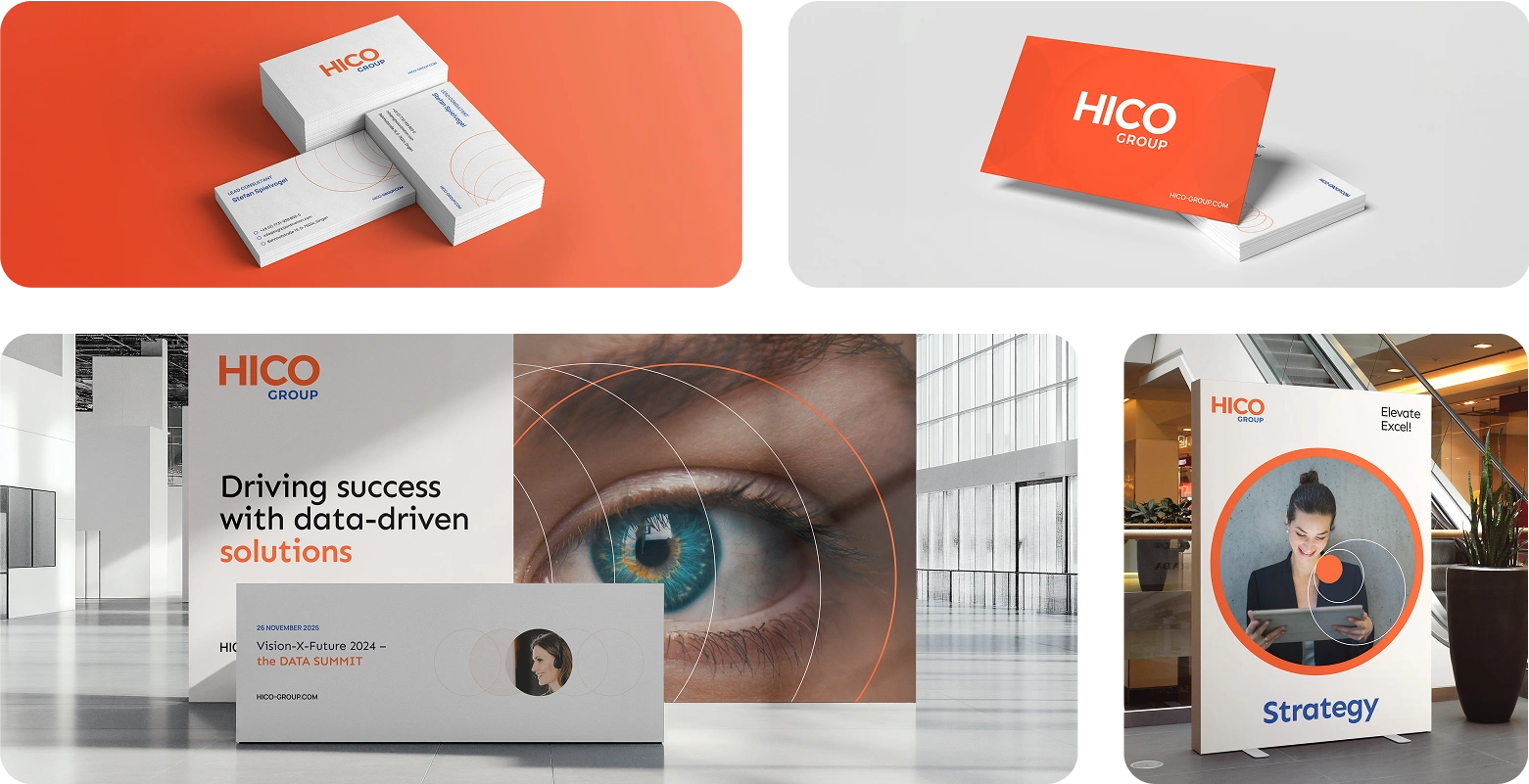
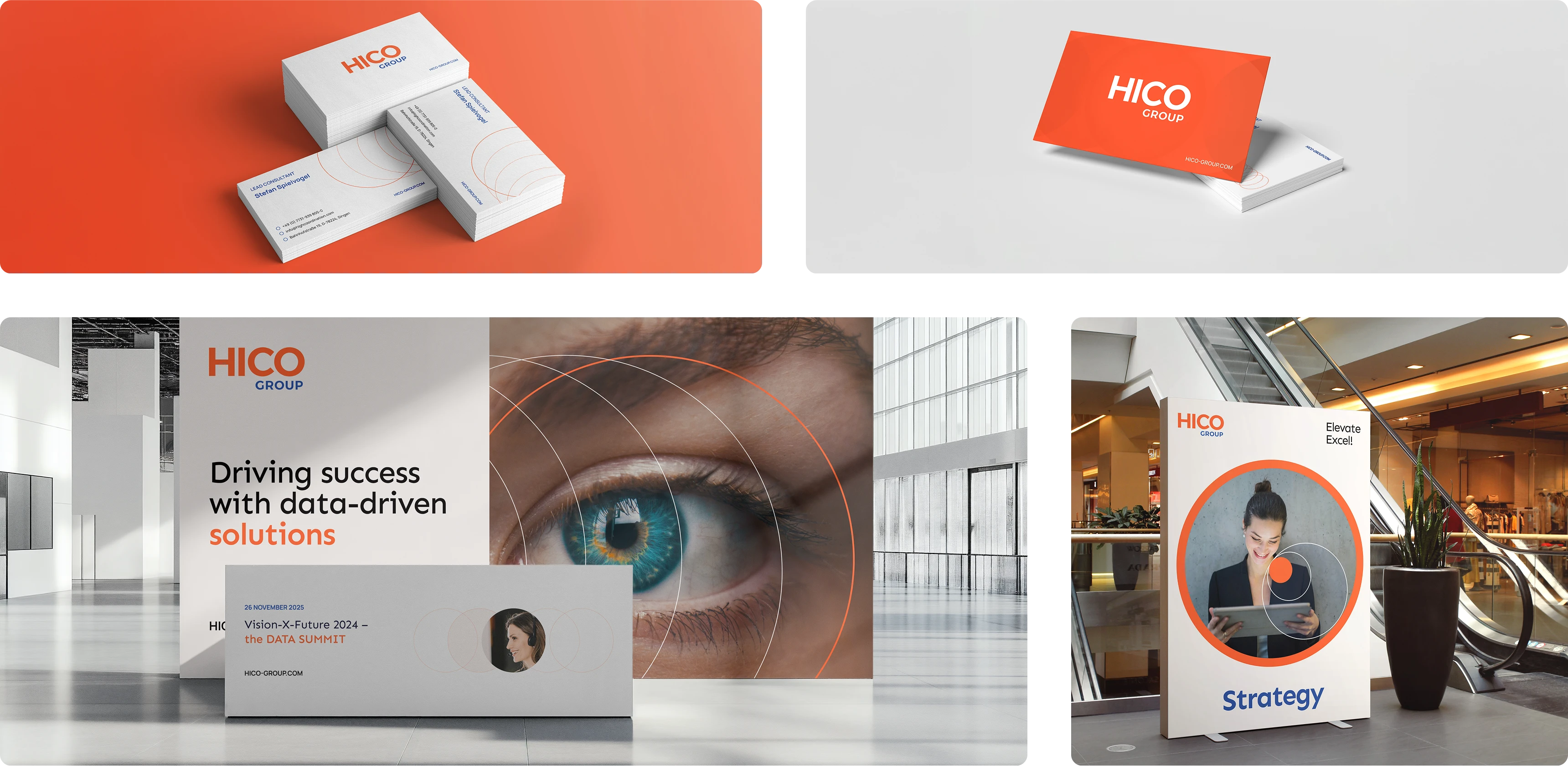
Visual language & Stationary
Our Challenge
Striking a balance between modernisation and brand recognition
Our Solution
We focused on incremental improvements rather than a complete redesign
Similar Projects