Hartree Mosaic
Hartree Mosaic
Hartree Mosaic
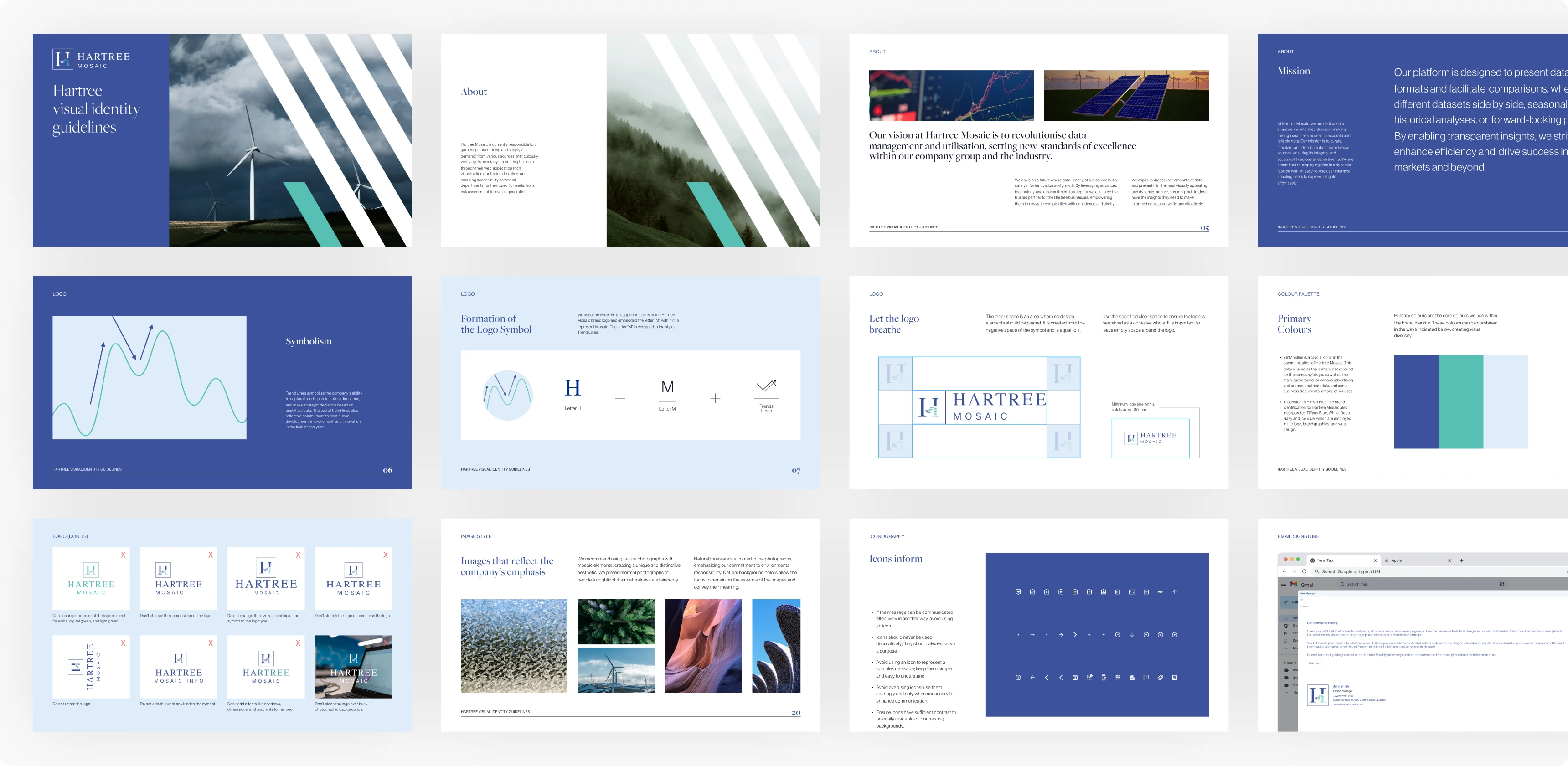
For Hartree Mosaic, we revitalized their brand by focusing on both strategic and visual elements. We started with a thorough analysis of their business model, target market, and existing branding, alongside a review of the competitive landscape. This informed the development of a new mission and vision that align with the company's goal to lead in data analytics. We also defined key values that reflect their corporate culture. A pivotal aspect was redesigning the logo, making it more aligned with the brand’s modern, innovative, and dynamic nature. Furthermore, we crafted a comprehensive branding system, including updated data visualization principles, ensuring consistency across all materials. As a result, Hartree Mosaic now has a refreshed branding strategy that enhances their market position and supports their vision.


Logo refresh
context
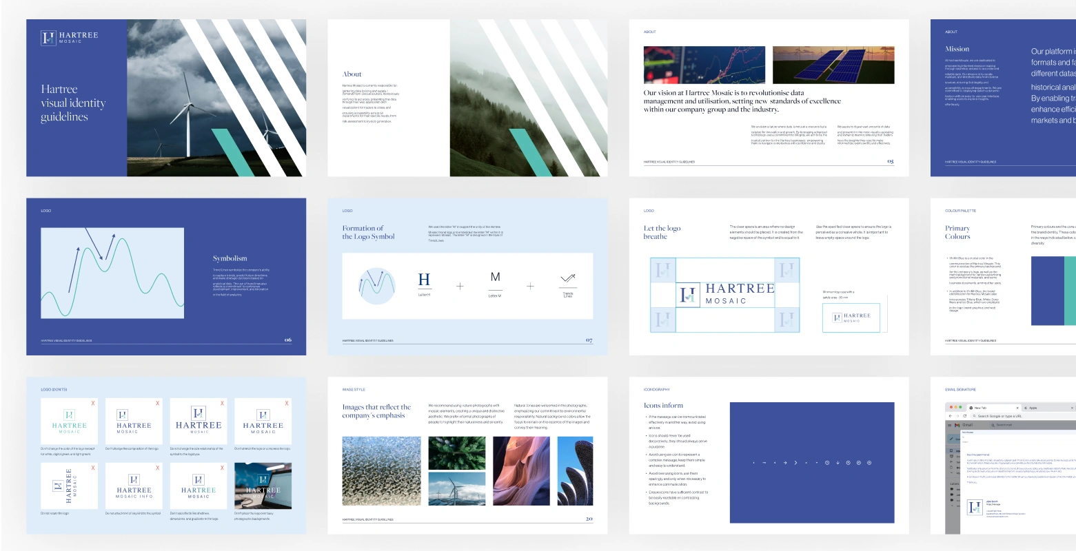
As part of Hartree Mosaic’s evolution, there was a need to refine its brand identity to better align with its mission of delivering accurate, well-visualised data. The existing branding, while functional, required a more polished and modern approach to reflect the company’s commitment to innovation, reliability, and seamless user experience. The refresh was designed to enhance brand recognition while maintaining the fundamental essence of Hartree Mosaic’s identity.
what we did
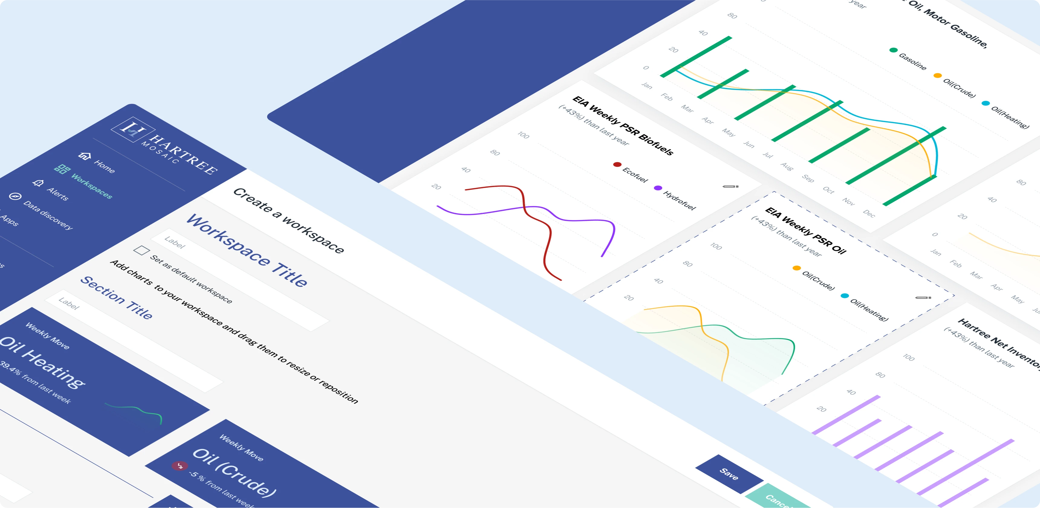
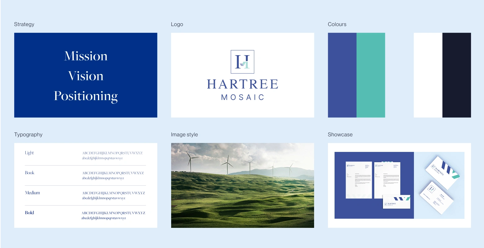
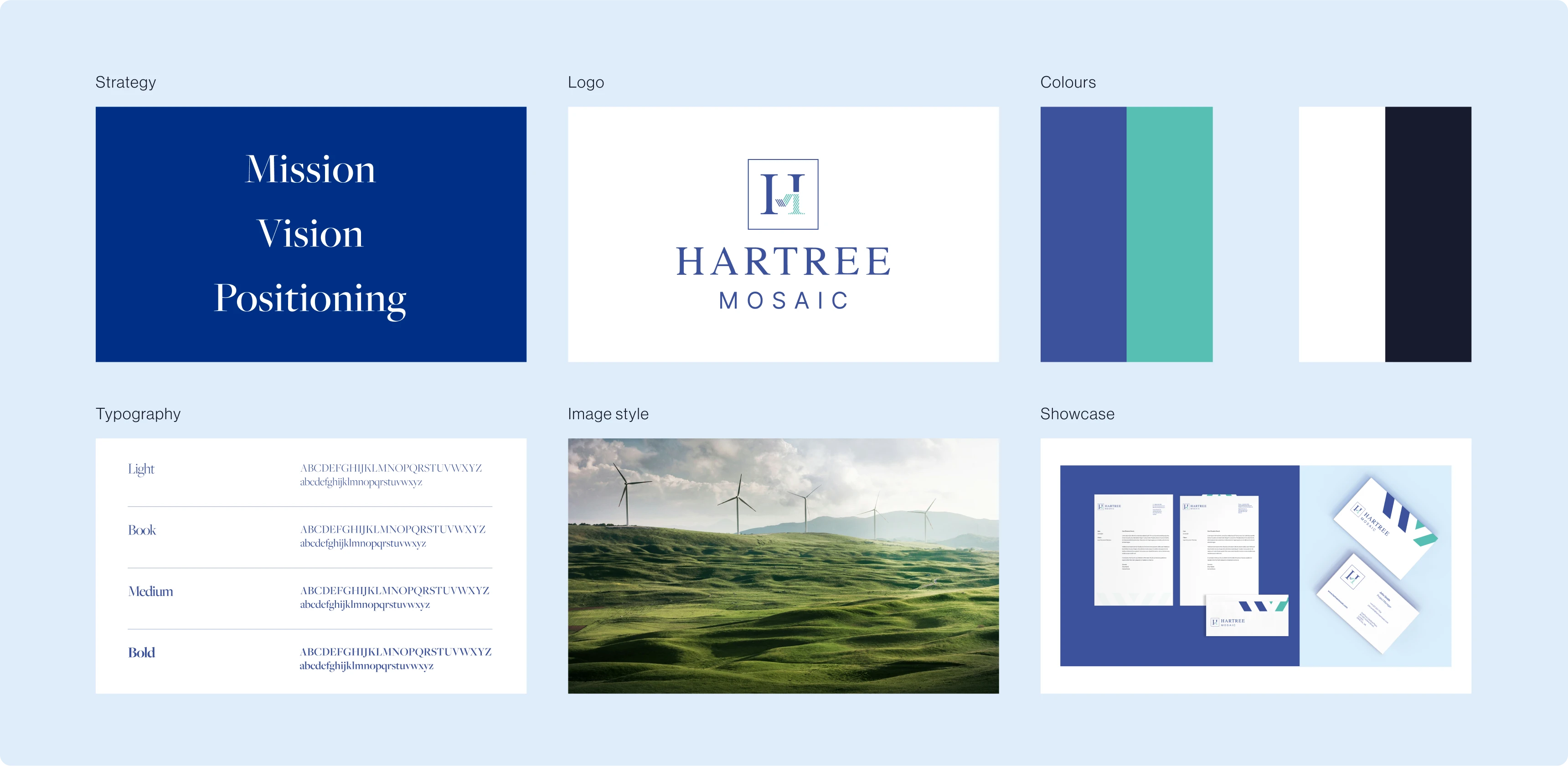
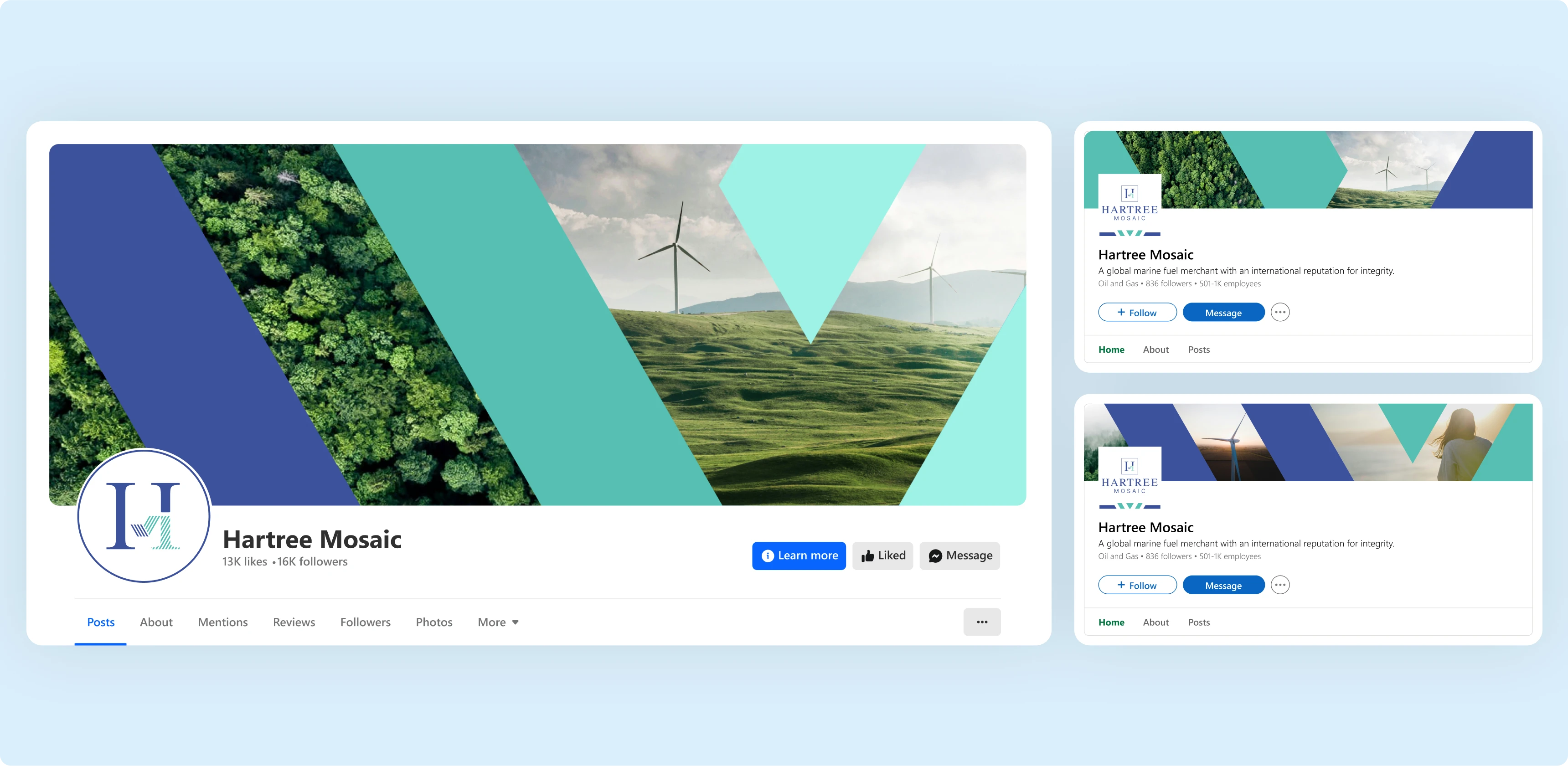
We undertook a strategic logo refresh that retained the brand’s core symbolism while refining its execution. By incorporating the letter "H" for Hartree and embedding the "M" in the style of trend lines, we created a cohesive and dynamic mark. This design visually represents Hartree Mosaic’s ability to track market trends and provide actionable insights. The revised logo ensures flexibility for use across multiple mediums, maintaining clarity and impact.
Brand guide
design elements
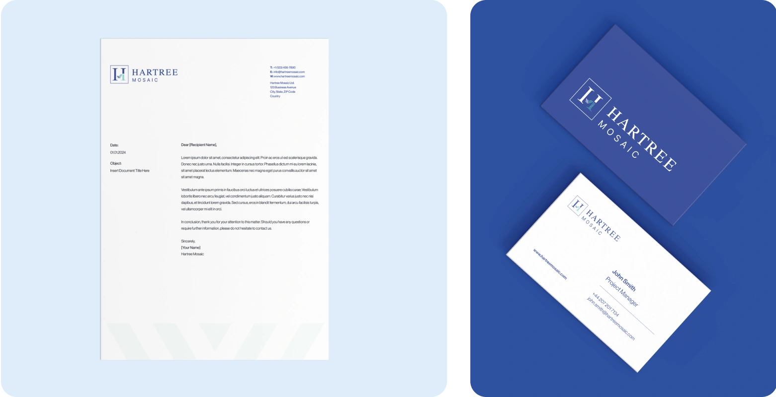
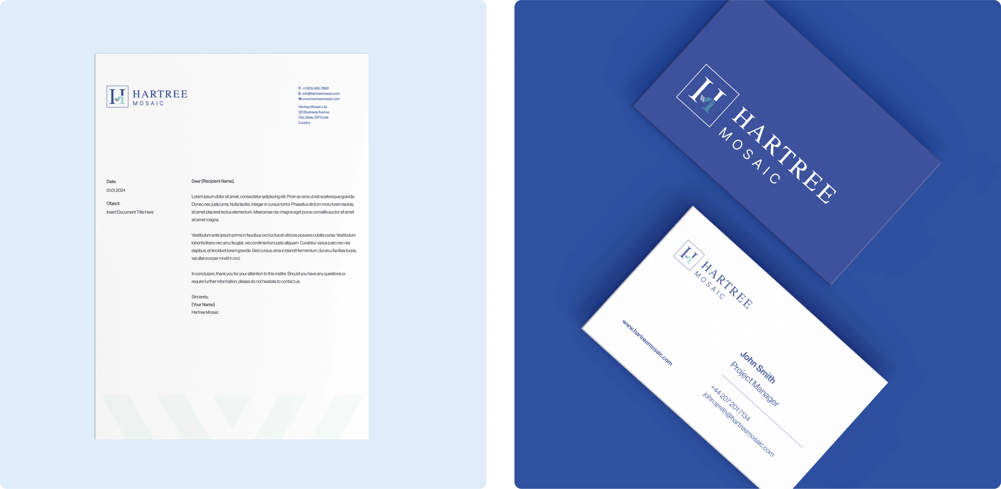
The brand guide establishes consistency across all visual touch points by detailing typography, color palettes, and logo usage. The primary typography choices include Freight Big Pro for headings, offering an elegant yet strong visual presence, and Neue Haas Grotesk Display Pro for body text, ensuring readability and modern aesthetics. Public Sans is used for web applications to maintain a seamless digital experience. The colour palette is anchored in blue, signifying trust and intelligence, complemented by Tiffany Blue, Deep Navy, Ice Blue, and White to create a refined and sophisticated brand presence.
Visual language & Stationary
Our Challenge
Aligning Hartree Mosaic’s identity with the Hartree Group while highlighting its unique innovation
Our Solution
We embedded key messages into the branding, highlighting innovation and insights

Similar Projects